Client First Homepage for Coaches
Your website is not just a digital business card.
For many coaches, it is the first place a potential client goes after seeing a post, hearing your name, or getting a referral.
That moment matters.
If your homepage mostly talks about you, your story, your certifications, and your passion, the visitor may still leave with one unanswered question:
“Is this coach actually right for me?”
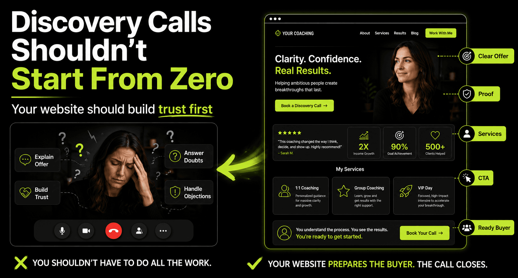
A client-first homepage answers that question quickly.
It does not ignore your story.
It simply starts with the visitor’s problem first.
It shows who you help, what outcome you support, and why someone should trust you enough to take the next step.
If you want the bigger picture first, you can also read this guide on how to build a coaching website that attracts clients.
Why a Client-First Homepage Matters
Your homepage is often where people orient themselves.
Even if someone lands on a blog post, social link, or services page first, they may still click back to the homepage to understand the bigger picture.
They want to know what you do.
They want to know who you help.
They want to know whether your work feels relevant to their situation.
And they usually decide very quickly.
If your homepage does not make that clear, most visitors will not take the time to figure it out.
They will leave.
Not because they disliked you.
Not because your coaching is weak.
Because the page did not give them enough confidence to stay.
People do not book coaching because a website looks nice. They book when they feel understood, safe, and clear about the next step.
Coaching is a personal decision.
A visitor may be dealing with stress, confusion, burnout, lack of direction, leadership pressure, health struggles, or a major life transition.
They are not casually shopping.
They are asking quiet questions in their mind:
- Will this person understand me?
- Can I trust them?
- Have they helped people like me?
- What kind of result can I expect?
- What happens if I book a call?
A strong homepage helps answer those questions before the visitor has to ask.
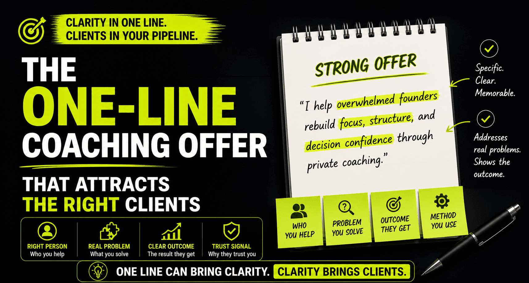
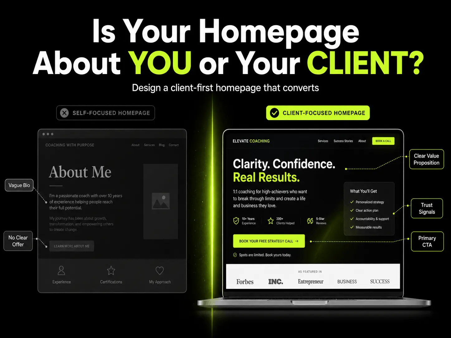
Craft a Clear, Outcome-Focused Value Proposition
The first section of your homepage should not make people work hard.
It should tell them, in simple language, what you do and why it matters.
This is where your value proposition comes in.
It should usually answer three things:
- Who you help
- What problem or outcome you focus on
- How you help them move forward
For example, this is too broad:
“I help people unlock their potential.”
It sounds positive.
But it could mean almost anything.
A clearer version would be:
“I help overwhelmed founders rebuild focus and decision confidence without adding more pressure to their week.”
That sentence does more work.
It names the audience.
It names the problem.
It gives the visitor a direction.
The goal is not to sound clever.
The goal is to make the right person think:
“This sounds like me.”
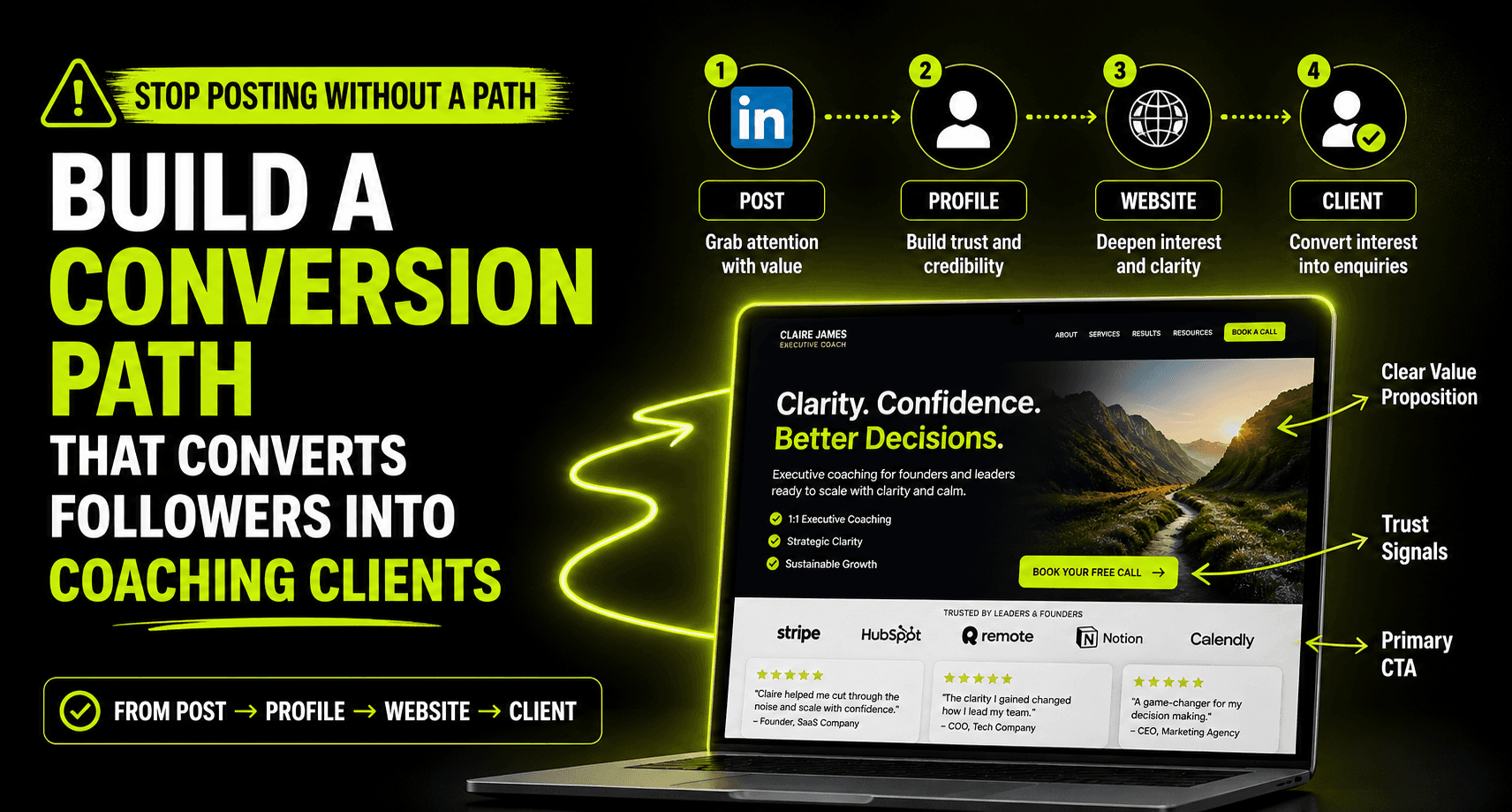
This is also why your website and LinkedIn content need to connect. If you are posting regularly but not getting enough enquiries, this article on posting without a path explains where that gap usually happens.
Show Your Personal Brand and Story
Your story still matters.
In coaching, people are not just buying sessions.
They are buying into your thinking, your energy, your lived experience, and your ability to guide them.
So yes, your background matters.
Your values matter.
Your reason for doing this work matters.
But timing matters too.
If your homepage starts with a long biography before the visitor understands whether you can help them, your story may not land.
Start with the client’s situation first.
Then bring in your story as proof of why you are the right guide.
Your About section should not read like a résumé.
It should help the visitor understand:
- Why you do this work
- What shaped your approach
- Who you are best suited to help
- Why your perspective is trustworthy
Use photos that match the type of coaching you offer.
If you are a high-performance coach, your visuals should feel sharp and confident.
If you are a wellness or mindfulness coach, your visuals may need to feel calmer and more grounded.
The point is not to look perfect.
The point is to feel real and aligned.
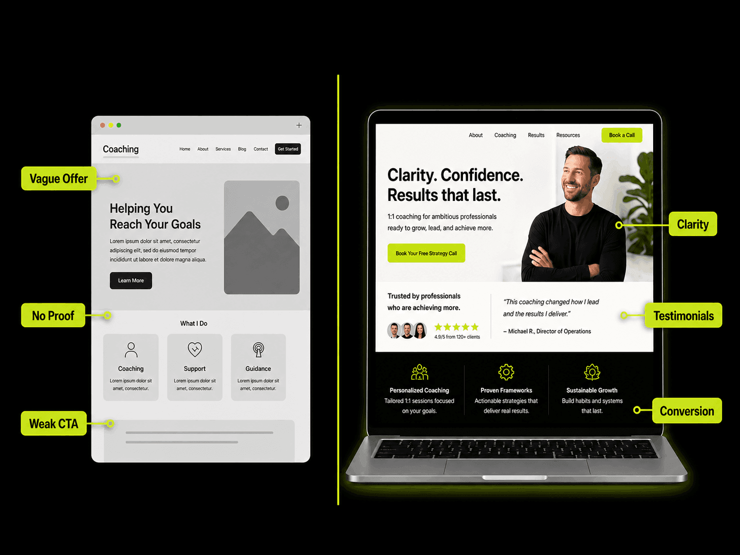
Design Services Pages Around Outcomes
Your services page is where interest starts turning into decision-making.
This is where many coaching websites become too thin.
They say something like:
“1:1 coaching available. Book a call to learn more.”
That is not enough.
Before someone books, they usually want to understand what they are stepping into.
They want to know who the offer is for.
They want to know what kind of problem it solves.
They want to know what happens during the process.
They want to know what result they can reasonably expect.
So instead of only listing sessions, describe the transformation.
For example, instead of saying:
“6 coaching sessions over 3 months.”
You could say:
“A 3-month coaching process to help you simplify your priorities, rebuild decision confidence, and create a weekly structure you can actually follow.”
That feels clearer.
It gives the visitor something to imagine.
It also makes the discovery call easier because the person arrives with context.
For more articles around coaching growth, website clarity, and conversion, you can explore the Coaching Business Growth category.
Offer Lead Magnets for Visitors Who Are Not Ready Yet
Not every visitor is ready to book a call today.
That does not mean they are a bad lead.
Some people need more time.
Some are still comparing options.
Some are interested but not ready to talk.
Some want to understand your approach before they share their situation.
If your only option is “Book a Call,” you may lose people who could become clients later.
This is where a lead magnet helps.
A lead magnet is simply a useful free resource that gives visitors a smaller first step.
For coaches, this could be:
- A short checklist
- A self-assessment
- A short guide
- A mini training
- A quiz
- An email series
The goal is not to give away everything.
The goal is to build trust.
A good free resource does not weaken your coaching offer. It helps the right person feel safer taking the next step.
Use Social Proof That Actually Builds Trust
Trust is everything in coaching.
People want to know that others have worked with you and experienced real change.
But not all proof is equal.
A vague testimonial like this is nice, but weak:
“She was amazing. I highly recommend her.”
It sounds positive.
But it does not explain what changed.
A stronger testimonial gives context:
“Before coaching, I was constantly reacting to everyone else’s priorities. After a few weeks, I had a clearer weekly structure, stronger boundaries, and more confidence in difficult conversations.”
That kind of proof is more useful.
It shows the before.
It shows the after.
It helps the visitor recognise their own situation.
Your homepage and services page should include proof near the points where people are deciding whether to act.
Use testimonials, short case studies, client outcomes, podcast features, publication logos, or any relevant credibility signals.
Just make sure they are specific.
Generic proof feels decorative.
Specific proof builds confidence.
If you want to go deeper into how a coaching website can turn trust into enquiries, read Coaching Website That Attracts Clients.
Prioritise Simple Navigation and User Experience
Your website should not feel like a maze.
A visitor should be able to quickly find:
- What you do
- Who you help
- How your coaching works
- Proof that you can help
- How to take the next step
Use simple navigation labels.
Home.
About.
Services.
Blog.
Contact.
You do not need clever names for basic pages.
Clever navigation often creates unnecessary friction.
And friction makes people leave.
The same applies to images.
Avoid generic stock photos that could belong to any coach, consultant, or wellness brand.
Use visuals that support your message.
Real photos, behind-the-scenes images, client-relevant situations, or simple visuals that explain your process usually work better.
Good design does not make people guess. It quietly guides them.
Create Clear Calls to Action and a Seamless Booking Experience
Every important page should have a clear job.
Your homepage should guide visitors somewhere.
Your services page should guide visitors somewhere.
Your blog posts should guide visitors somewhere.
That “somewhere” should not be vague.
Instead of using only soft CTAs like:
“Learn more.”
Use something more specific:
- Book a discovery call
- Apply for coaching
- Download the coaching checklist
- Take the self-assessment
- Get the free guide
Your primary CTA should be for people who are ready to talk.
Your secondary CTA should be for people who need more time.
Also, make the booking process simple.
If someone has to message you back and forth just to find a time, you are adding friction at the worst possible moment.
Use a clear booking page, calendar tool, or contact form that makes the next step easy.
Design for Mobile and Speed
Many visitors will check your website from their phone.
They may be coming from LinkedIn.
Or Instagram.
Or a referral message.
Or a quick Google search.
That means your homepage needs to work well on a small screen.
Your headline should be readable.
Your CTA should be easy to tap.
Your proof should not be buried too far down.
Your page should load quickly.
A slow or cluttered mobile experience makes your coaching feel harder to trust, even if your offer is strong.
Use compressed images.
Keep the layout simple.
Avoid unnecessary effects that slow the page down.
The goal is not to impress people with complexity.
The goal is to help them move.
Answer Real Questions and Provide Useful Content
A good coaching website should answer the questions people already have.
Not just the questions you wish they had.
Visitors may want to know:
- How does coaching work?
- Who is this best for?
- What kind of results are realistic?
- How long does the process take?
- What happens on the first call?
- What if I am not ready yet?
- How is this different from therapy, consulting, or mentoring?
Your homepage does not need to answer everything.
But your website should give people a way to explore.
This is where blogs, FAQs, guides, podcasts, and resource pages help.
Useful content builds trust before the call.
It also helps people understand your thinking.
That matters because coaching is not just about what you offer.
It is also about how you see the problem.
You can keep building this trust through educational content on your 100XLift blog.
Make Contact Easy
When someone is ready to reach out, do not make them hunt.
Your contact path should be obvious.
Put your booking link or contact button in visible places.
Add your email where appropriate.
Keep your contact form simple.
Link to your social profiles if you want people to stay connected.
If you run events, group programmes, or workshops, make those easy to find too.
The easier the next step feels, the more likely someone is to take it.
Small friction can kill real interest.
Conclusion
A client-first homepage is not about adding more sections.
It is not about flashy graphics.
It is not about making the site look expensive for the sake of it.
It is about making the visitor feel clear.
Clear about who you help.
Clear about the problem you solve.
Clear about why they should trust you.
Clear about what they should do next.
That is what separates a passive coaching website from one that actually supports client growth.
Lead with the client’s problem.
Show your story as proof.
Describe your services through outcomes.
Give not-ready visitors a softer step.
Use proof that feels specific.
Make the path easy.
The best coaching websites do not try to impress everyone. They help the right person feel confident enough to move forward.
For more coaching business growth resources, visit the 100XLift homepage or browse the Coaching Business Growth category.
Sources
- Nielsen Norman Group – Homepage Usability Guidelines: Research emphasising clear taglines, simple navigation, and useful homepage content.
- International Coaching Federation – Building a Coaching Website: Guidance on clarity, authentic connection, testimonials, and contact information.
- IGV – How to Structure a Homepage That Converts in 2026: Advice on value propositions, hierarchy, trust signals, and calls to action.
- Elementor – Inspiring Coaching Websites to Model in 2026: Insights on value propositions, personal branding, services pages, lead magnets, and social proof.
- ImpactPlus – Website Strategy in 2026: Discussion of buyer-focused websites, answering real questions, and providing proof.
- Call to Action (Marketing): Definition and role of clear action language in marketing.
- Testimonial (Marketing): Background on testimonials and their use as trust-building content.